Creating Instagram Cover Grid Effects Using Instagram Grid Generators
Summary
This article provides a detailed guide on how to use Instagram grid generators to create eye-catching Instagram cover grid effects. We'll explore the steps for creating Instagram grids, compare popular tools, discuss creative applications, and share best practices. Whether you're an individual user or a brand manager, this guide will help you master Instagram grid layout techniques to enhance your social media presence.
Introduction
Instagram cover grid effects are becoming increasingly popular in social media marketing. Many Instagram influencers and brand accounts are cleverly utilizing these Instagram grid layouts to attract attention. For example, the official account of the renowned K-pop girl group aespa, @aespa_official, showcases an impressive Instagram grid effect. Through carefully designed grid layouts, they've successfully created a visually striking profile with high brand recognition.
This article will delve into how to use Instagram grid generator tools to create these attention-grabbing Instagram grid effects. We'll cover the basic concepts of Instagram grid creation, popular grid generator tools, detailed step-by-step instructions, and creative application methods. Whether you want to enhance the appeal of your personal Instagram account or create a unique social media image for your brand, this guide will provide practical Instagram grid layout tips and inspiration.
Let's explore how to use Instagram grid generators to create stunning Instagram cover grid effects!
What is an Instagram Cover Grid Effect?
Definition and Characteristics
The Instagram cover grid effect, also known as an Instagram puzzle or grid layout, is a unique visual presentation method that divides a single large image into nine equal square images, which are then posted in a specific order on an Instagram profile. When users visit your Instagram profile, these nine images combine to form a complete large image, creating an eye-catching cover effect.
Key features of this Instagram grid layout include:
-
Strong visual impact:
- The large image is divided into nine parts, creating a unique puzzle effect.
- Immediately attracts visitors' attention, making your profile stand out.
-
Large creative display space:
- Provides a huge "canvas" for showcasing large images or complex designs.
- Allows brands or individual creators to tell visual stories innovatively.
-
Enhances profile professionalism:
- A well-designed grid effect demonstrates the user's design skills and attention to detail.
- Gives an impression of thoughtful planning and curation.
-
Strengthens brand recognition:
- Can be used to showcase logos, product lines, or brand colors.
- Helps establish a consistent brand image and visual identity.
-
High flexibility:
- Can be updated regularly to keep the profile fresh.
- Suitable for various content types, such as product displays, artwork, photography, etc.
-
Encourages interaction:
- Unique visual effects can attract users to browse your entire Instagram feed.
- Can create interactive puzzles to encourage follower engagement.
-
Reflects planning and strategy:
- Requires advance planning and design, demonstrating professional account management.
- Can be used to preview upcoming content or events.
-
Mobile-friendly:
- Designed specifically for the Instagram mobile app, optimal for smartphone screens.
- Considers the fact that most users access Instagram via mobile devices.
The Instagram cover grid effect is not just a visual trick; it's a powerful marketing and brand-building tool. By cleverly using this Instagram grid layout, individual creators and brands can create memorable first impressions, effectively convey their messages, and stand out in the competitive social media landscape.
Successful Case Studies
Let's continue with the example of the aespa_official account mentioned in the introduction, analyzing their Instagram grid creation effect in depth. Here are some screenshots of their Instagram profile:
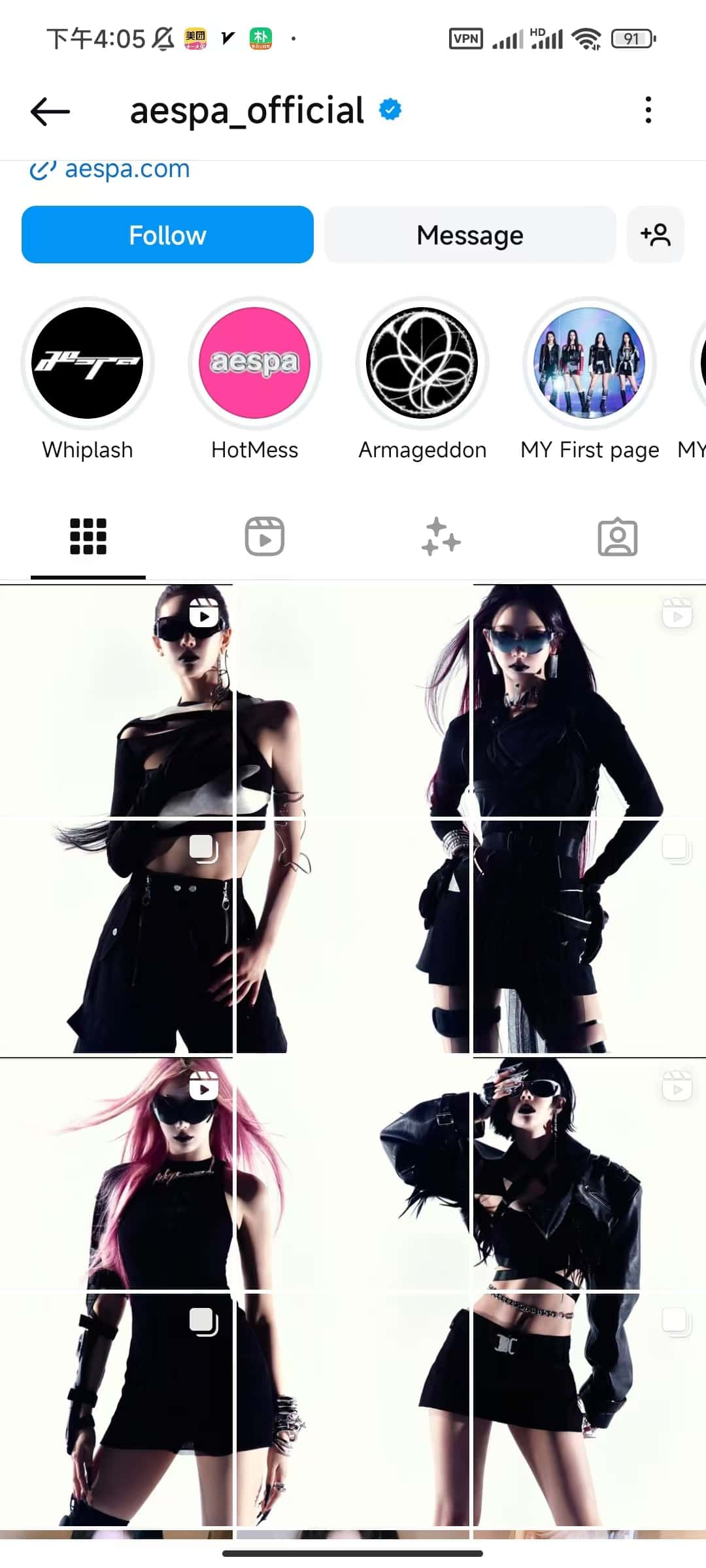
Analyzing the first image, we can see:
The aespa_official Instagram cover grid effect showcases an excellent case study. Their profile presents an impressive set of grid layouts:
- The overall layout contains four large images, each cleverly divided into a 3x3 grid.
- The image content shows four women wearing stylish black outfits and sunglasses, presenting a cool and avant-garde style.
- All images maintain a unified tone and aesthetic style, creating visual coherence and harmony.
The effects of this Instagram grid layout are significant:
- The strong visual impact immediately attracts viewers' attention.
- The unified style effectively reinforces the brand image.
- The creative division method showcases both the overall picture and individual details.
- The professional design leaves a deep impression, elevating the brand's tone.
This case perfectly demonstrates the potential of the Instagram cover grid effect, not only enhancing brand recognition but also increasing user engagement, making it an excellent example of using Instagram grid generators.
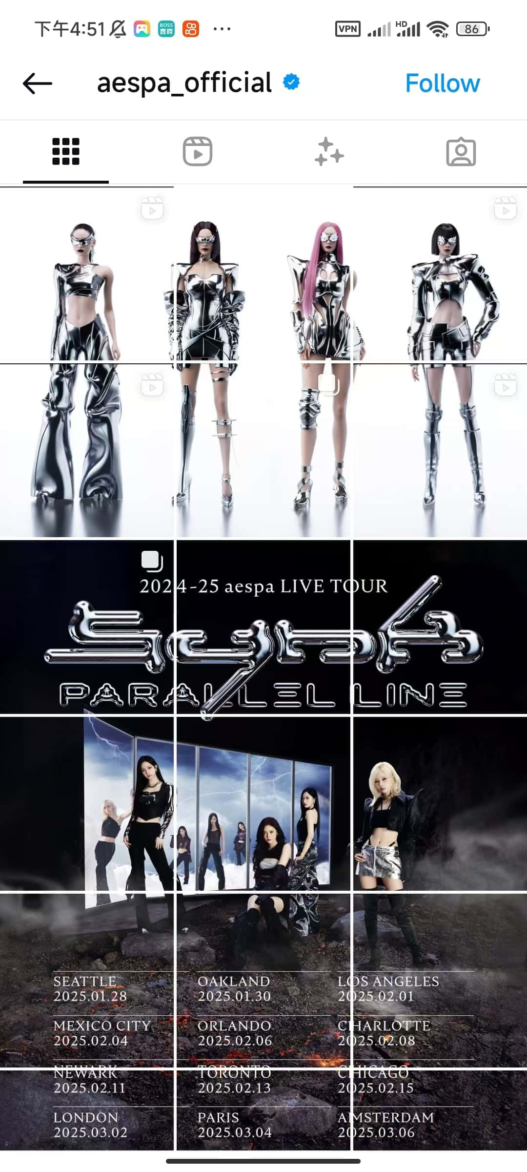
Looking at the second image:
Another impressive Instagram grid creation case from the aespa_official account demonstrates the versatility and creativity of grid layouts:
- The entire layout is cleverly divided into three main sections, each occupying three rows, forming a visually striking three-part layout.
- The top three rows showcase full-body shots of the four members wearing futuristic silver outfits, presenting a unified and unique visual effect.
- The middle three rows announce "2024-25 aespa LIVE TOUR PARALLEL LINE" with a black background and silver text design, highlighting the tour information.
- The bottom three rows display the tour poster and specific tour dates and locations, providing detailed performance information.
The effects of this Instagram grid layout are remarkable:
- Clear hierarchy, conveying information powerfully and clearly.
- Each of the top, middle, and bottom sections has its own focus, but the overall style is unified, demonstrating strong brand recognition.
- Cleverly utilizes Instagram's grid feature, perfectly combining promotional posters, tour information, and artist photos.
- Through carefully designed layouts, it maximizes the display of rich content in limited space.
This case fully demonstrates the creative application of Instagram grid layouts in music tour promotion, not only attracting fans' attention but also efficiently conveying key information, making it an excellent example of using Instagram grid generators for event promotion.
Introduction to Instagram Grid Generators
What are Instagram Grid Generators?
Instagram grid generators are online tools specifically designed to create Instagram grid layouts. These tools automatically divide a single large image into multiple small squares, allowing users to easily create eye-catching Instagram grid layouts. Here are the main features and functions of Instagram grid generators:
-
Image splitting:
- Automatically cuts a large image into 9 (or more) equal square images.
- Supports various splitting modes, such as 3x3, 3x1, 1x3, etc., to meet different creative needs.
-
Preview function:
- Real-time preview of the split effect, allowing users to see the final presentation on Instagram intuitively.
- Allows users to adjust and optimize the layout before uploading.
-
Ease of use:
- User-friendly interface, usually requiring only simple drag-and-drop operations to upload images.
- Provides intuitive setting options, such as grid size and spacing adjustments.
-
Export function:
- Exports split images in the correct order, making it easy for users to upload to Instagram in sequence.
- Usually supports various image formats, such as JPEG and PNG.
-
Additional features:
- Some advanced tools also provide filters, text addition, and simple image editing functions.
- May include a template library, offering ready-made creative layout solutions.
-
Cross-platform compatibility:
- Most are web-based tools that can be used on various devices, including computers, tablets, and smartphones.
-
Social media integration:
- Some tools offer direct posting to Instagram, simplifying the workflow.
Instagram grid generators greatly simplify the process of creating complex Instagram layouts, allowing individual users, brands, and businesses to easily create professional-looking Instagram grid effects. These tools not only save time and effort but also provide users with more creative possibilities, helping them visually attract more followers and enhance their social media presence.
Comparison of Common Instagram Grid Generator Tools
-
Postcron Image Splitter Website:
- Postcron Image Splitter Pros:
- User-friendly interface, easy to operate
- Supports multiple splitting modes
- Provides preview function Cons:
- May require registration to use all features
-
PineTools Split Image Website:
- PineTools Split Image Pros:
- Completely free, no registration required
- Supports various splitting methods and output formats Cons:
- Relatively simple interface, lacks advanced editing features
- Not specifically optimized for Instagram
-
ImageOnline Split Image Website:
- ImageOnline Split Image Pros:
- Simple and intuitive operation
- Supports multiple splitting methods Cons:
- Relatively basic functionality
- Lacks Instagram-specific optimization
-
My Social Boutique Instagram Grid Maker Website:
- Instagram Grid Maker Pros:
- Designed specifically for Instagram
- Offers various creative templates
- Includes basic editing functions Cons:
- Some advanced features may require payment
-
ImagesTool Split Images Website:
- ImagesTool Split Images Pros:
- Offers multiple splitting options
- Clear interface, easy to use Cons:
- May contain advertisements
- Lacks advanced editing features
-
ImageSplitter.vip Instagram Splitter Website:
- ImageSplitter.vip Instagram Splitter Pros:
- Specifically optimized for Instagram
- Provides real-time preview
- Supports multiple splitting modes
- Completely free, no registration required Cons:
- May lack some advanced editing features
Each Instagram grid generator tool has its unique advantages and limitations. Users can choose the most suitable tool based on their specific needs and preferences. For most Instagram users, tools specifically optimized for Instagram (such as My Social Boutique and ImageSplitter.vip) may be more convenient and practical.
Steps to Use Instagram Grid Generators
Next, we'll demonstrate how to create an Instagram grid effect using the Instagram Splitter tool from ImageSplitter.vip.
-
Choose a suitable image We'll use a new image for this operation, selecting an attractive portrait photo.
-
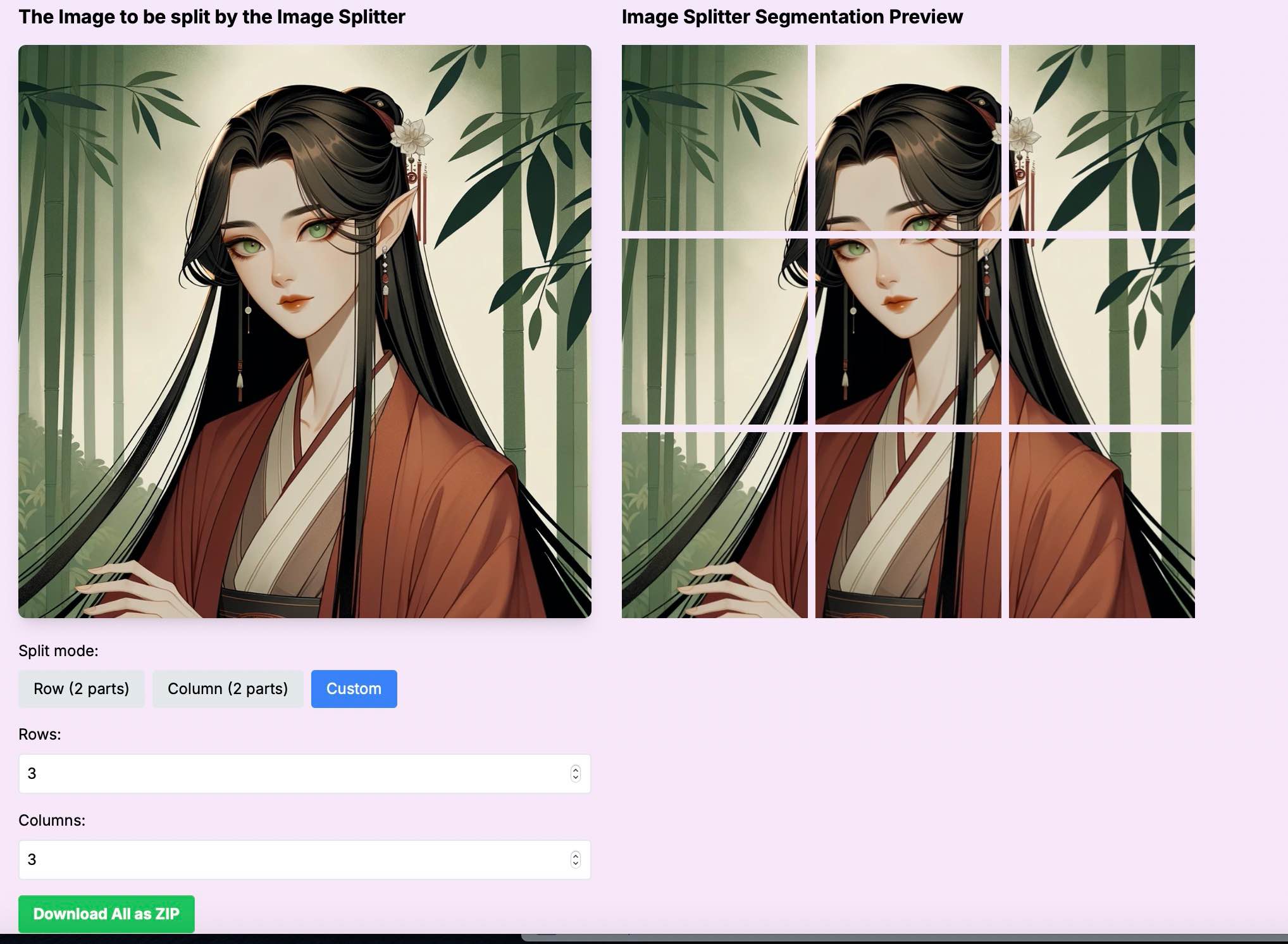
Upload the image to the grid generator As shown in the image below, click upload or drag the image to the upload area on the left. The original image is displayed on the left, and the preview area on the right shows the final visual effect after grid splitting.
-
Set splitting parameters While uploading the image, we've already adjusted the splitting parameters. Set the splitting mode to custom mode and set both rows and columns to 3, creating a 3x3 grid effect. Note that Instagram cover grid effects are typically displayed in three rows, so you can choose ratios like 3x1, 3x2, 3x3, 3x4, 3x5, etc., as needed. This ensures you create a true Instagram cover grid effect.
-
Preview and adjust As shown in the image above, the advantage of ImageSplitter.vip's Instagram Splitter tool is its real-time preview function. Once you upload an image and adjust the splitting ratio, the preview effect updates automatically. You can adjust the row and column values based on the content of your uploaded image to find the most suitable effect.
-
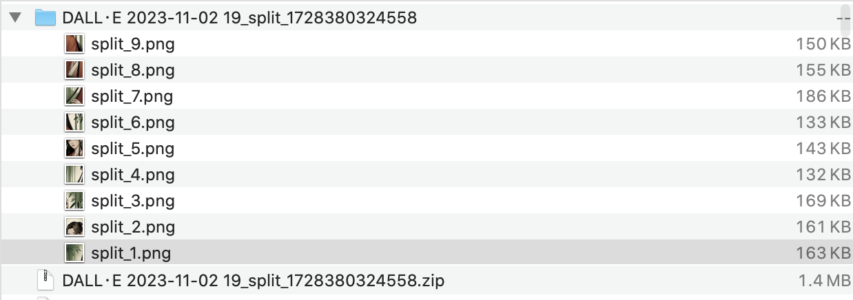
Download the split images After confirming that you're satisfied with the preview effect, click the "Download All as ZIP" button to download all grid images in one click. As shown in the image:
Posting Grid Effects on Instagram
-
Prepare posting materials We'll use the Instagram web version to post the grid effect. In the previous steps, we've obtained 9 split images, with file names clearly indicating the order, such as split_1.png to split_9.png.
-
Upload images in the correct order In the Instagram web version, click "Create New Post". As shown in the image below, we first select split_9.png. Note that the upload order must be in reverse, starting from the image with the highest number.
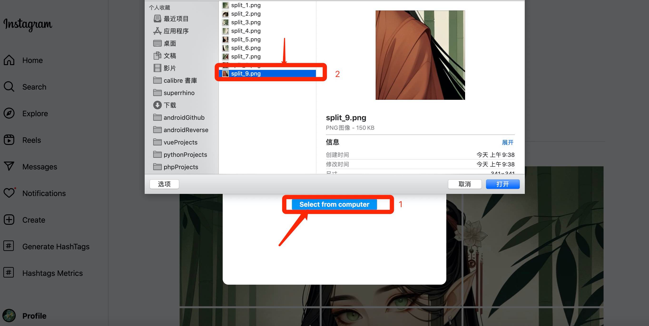 Then upload split_8.png, split_7.png, split_6.png, split_5.png, ... until split_1.png in sequence.
 -
Add captions and tags To demonstrate the cover effect, we won't add text or tags this time. Here's the final Instagram cover grid effect:
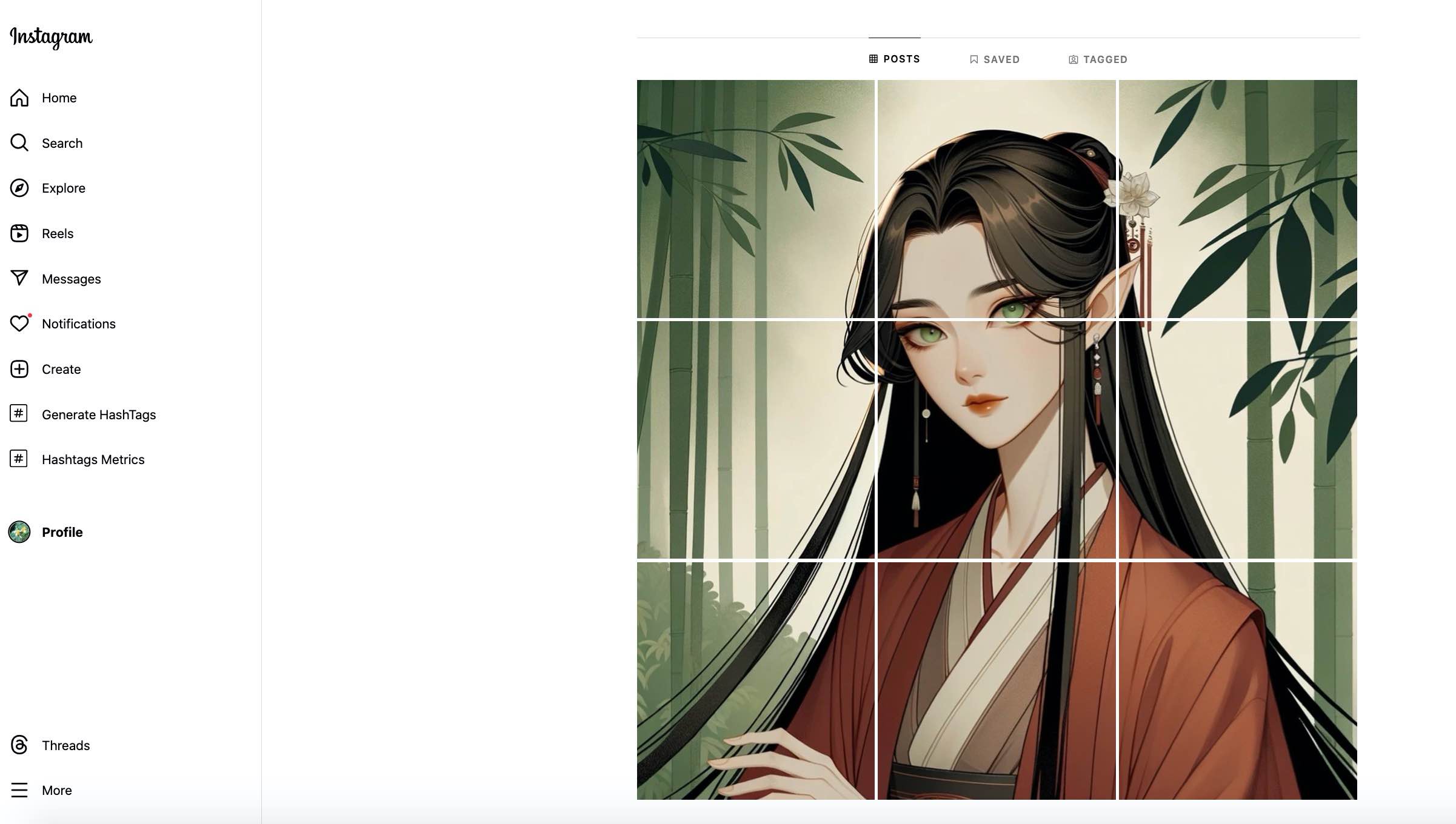 As you can see, this Instagram grid layout creates a clear, attractive image of a woman, greatly enhancing the visual effect.
Creative Ways to Use Grid Effects
Instagram's grid effect is not just a visual trick; it's a powerful marketing and brand-building tool. By cleverly using Instagram grid generators, we can create various eye-catching effects. Here are some creative ways to use them:
Showcasing Product Lines
-
Product matrix display:
- Use a 3x3 grid to showcase 9 different products, with each cell representing a product.
- For example, a cosmetics brand could display different lipstick shades in each cell.
-
Product detail display:
- Divide different angles or details of a single product into 9 cells.
- For instance, a watch brand could showcase the dial, strap, movement, and other details.
-
New product launch teasers:
- Use 9 cells to gradually reveal a new product, creating suspense and anticipation.
- You can follow aespa_official's approach, using a unified visual style to showcase a new clothing line.
Telling Brand Stories
-
Timeline narratives:
- Use 9 cells to showcase important milestones in brand development.
- Each cell represents a significant time point, arranged chronologically from left to right, top to bottom.
-
Value proposition display:
- Display the brand's core values separately in 9 cells.
- Use icons, short text, or relevant images to express each value.
-
Team introductions:
- Similar to aespa_official's approach, use 9 cells to showcase team members.
- Each cell can be a photo of a member or an image representing their work.
Creating Interactive Puzzles
-
Puzzle games:
- Design a large image, then use an Instagram grid generator to split it into 9 parts.
- Encourage fans to screenshot and rearrange, creating new image combinations.
-
Gradual event reveals:
- Similar to aespa_official's tour poster, gradually release 9 cells to reveal details of an upcoming event.
- Post one cell per day for 9 days, maintaining fan interest.
-
User-generated content:
- Create a themed hashtag, encouraging fans to upload brand-related photos.
- Select the 9 best user photos and use a grid generator to create a collective work.
By using tools like ImageSplitter.vip, brands and individual creators can easily implement these creative ideas. Remember, the key is to maintain visual consistency and appeal, just like in the aespa_official example. Whether showcasing products, telling brand stories, or creating interactive content, grid effects can help you stand out on Instagram and attract more attention.
Tips and Best Practices
When creating Instagram grid effects using grid generators, the following tips and best practices will help you achieve the best results:
Maintaining Image Quality
-
Use high-resolution images:
- Choose images with a resolution of at least 1080x1080 pixels to ensure each cell remains clear after splitting.
- Remember, Instagram compresses uploaded images, so starting with high quality is important.
-
Pay attention to file formats:
- Prioritize PNG format, especially for images containing text or logos.
- JPEG format is also acceptable, but choose high-quality settings.
-
Avoid over-editing:
- When using tools like ImageSplitter.vip, avoid over-editing the image before splitting.
- Excessive filters or adjustments may result in unnatural effects after splitting.
Considering Mobile Display Effects
-
Optimize thumbnail display:
- Remember, most users will browse Instagram on their phones.
- Ensure key elements are not cropped out in thumbnails.
-
Test on different devices:
- Preview the effect on different sized phones before posting.
- Pay special attention to text readability and visibility of small details.
-
Consider scrolling effects:
- Design with the user's scrolling experience in mind.
- Create a visual flow that guides users from one cell to the next.
Maintaining Style Consistency
-
Use a unified color scheme:
- Like in the aespa_official example, maintain consistency in overall color tones.
- You can use color themes to connect different grid series.
-
Maintain coherence of visual elements:
- Use similar visual elements across different cells.
- This could be consistent filters, similar compositions, or repeated graphic elements.
-
Plan long-term strategy:
- Consider how to keep multiple grid series harmonious overall.
- Design different visual styles for different themes or periods, but maintain overall consistency.
-
Pay attention to transitions:
- When switching to a new grid series, consider how to transition smoothly.
- You can use gradient colors or thematic elements to connect new and old content.
By following these tips and best practices, and making good use of Instagram grid generators like ImageSplitter.vip, you can create professional and attractive Instagram grid effects. Remember, the ultimate goal is to create an Instagram profile that is visually striking while effectively conveying your message or brand story.
Frequently Asked Questions
When creating and posting grid effects using Instagram grid generators, users often encounter some issues. Here are answers to some common questions:
How to ensure correct image order
-
Use correct naming conventions:
- Most Instagram grid generators (like ImageSplitter.vip) will automatically name split images in order, such as split_1.png to split_9.png.
- When uploading to Instagram, upload in reverse numerical order of file names (from 9 to 1).
-
Create a preview image:
- Before uploading, first assemble the split images locally to create a preview image.
- Check the upload order against the preview image to ensure it's correct.
-
Utilize Instagram's multiple image posting feature:
- Instagram allows uploading multiple images at once.
- When selecting images, make sure to choose them in the correct order (from the last to the first).
How to handle images of different sizes
-
Use square cropping:
- Before using the grid generator, first crop the image into a square.
- Most image editing tools have this function, including native photo apps on phones.
-
Utilize background filling:
- If the original image isn't square, you can extend it into a square using a white or other colored background.
- Some advanced Instagram grid generators (like ImageSplitter.vip) may provide this feature.
-
Creatively use non-square images:
- Split rectangular images into multiple squares to create unique visual effects.
- For example, a horizontal panoramic image can be split into a 3x1 layout.
How to update already published grids
-
Partial update strategy:
- Instagram doesn't allow replacing already published images, but you can delete old posts and re-upload.
- Consider updating only part of the grid, maintaining overall design continuity.
-
Creative transitions:
- When designing new grids, consider how to naturally transition from existing designs.
- You can use gradient colors or thematic elements to connect new and old content.
-
Archive old posts:
- If you don't want to delete old grids, you can use Instagram's archive function.
- This allows you to preserve content history while refreshing your profile's appearance.
-
Plan long-term strategy:
- When designing new grids, consider possible future updates.
- Create a design system that can flexibly change, facilitating future updates.
Remember, using Instagram grid generators like ImageSplitter.vip can greatly simplify these processes. These tools usually provide intuitive interfaces and real-time preview functions, helping you easily handle images of various sizes and ensure correct posting order. Whether creating new grids or updating existing designs, maintaining creativity and consistency is key.
Case Analysis
Examples of Instagram Accounts Successfully Using Grid Effects
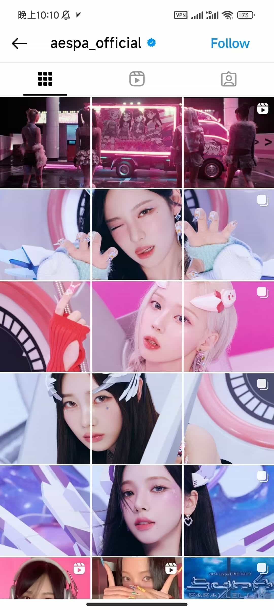
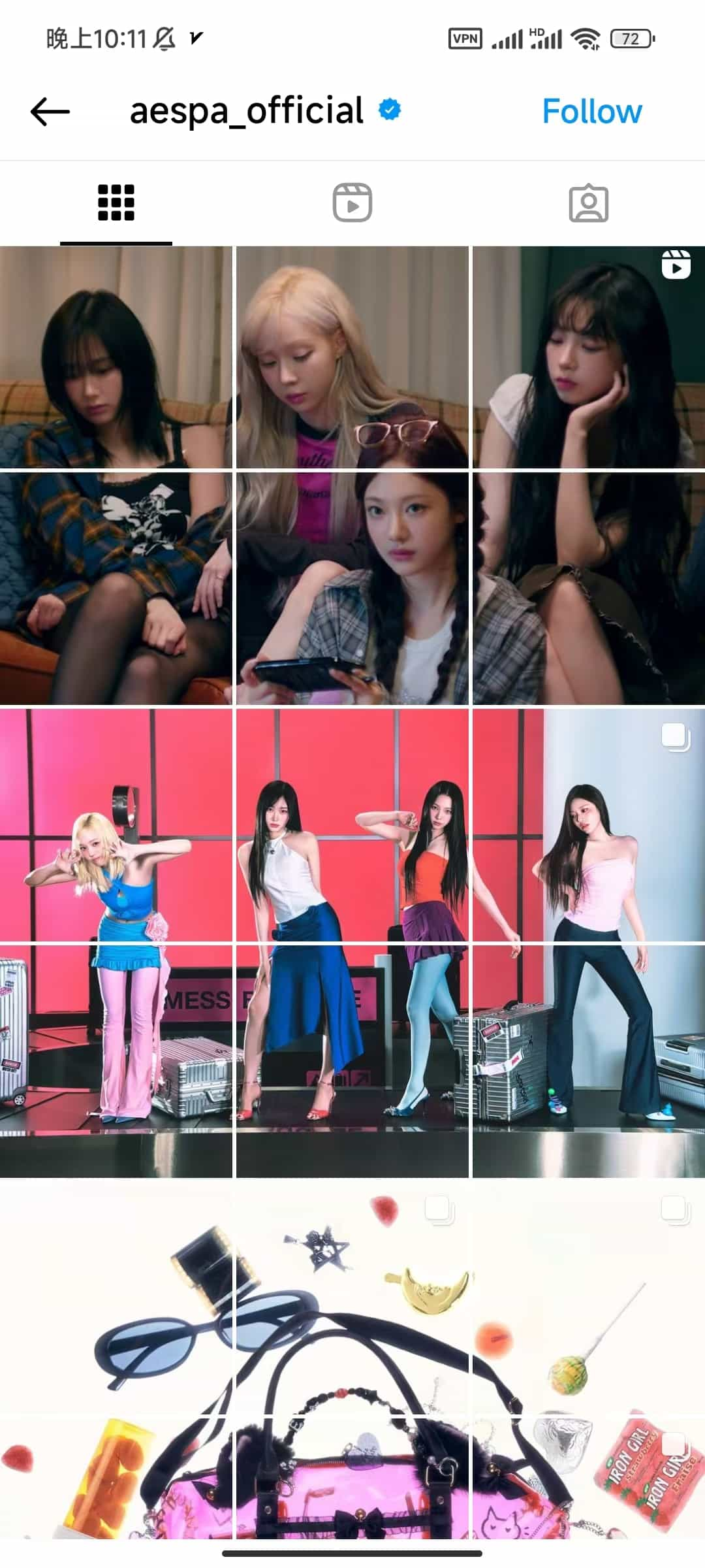
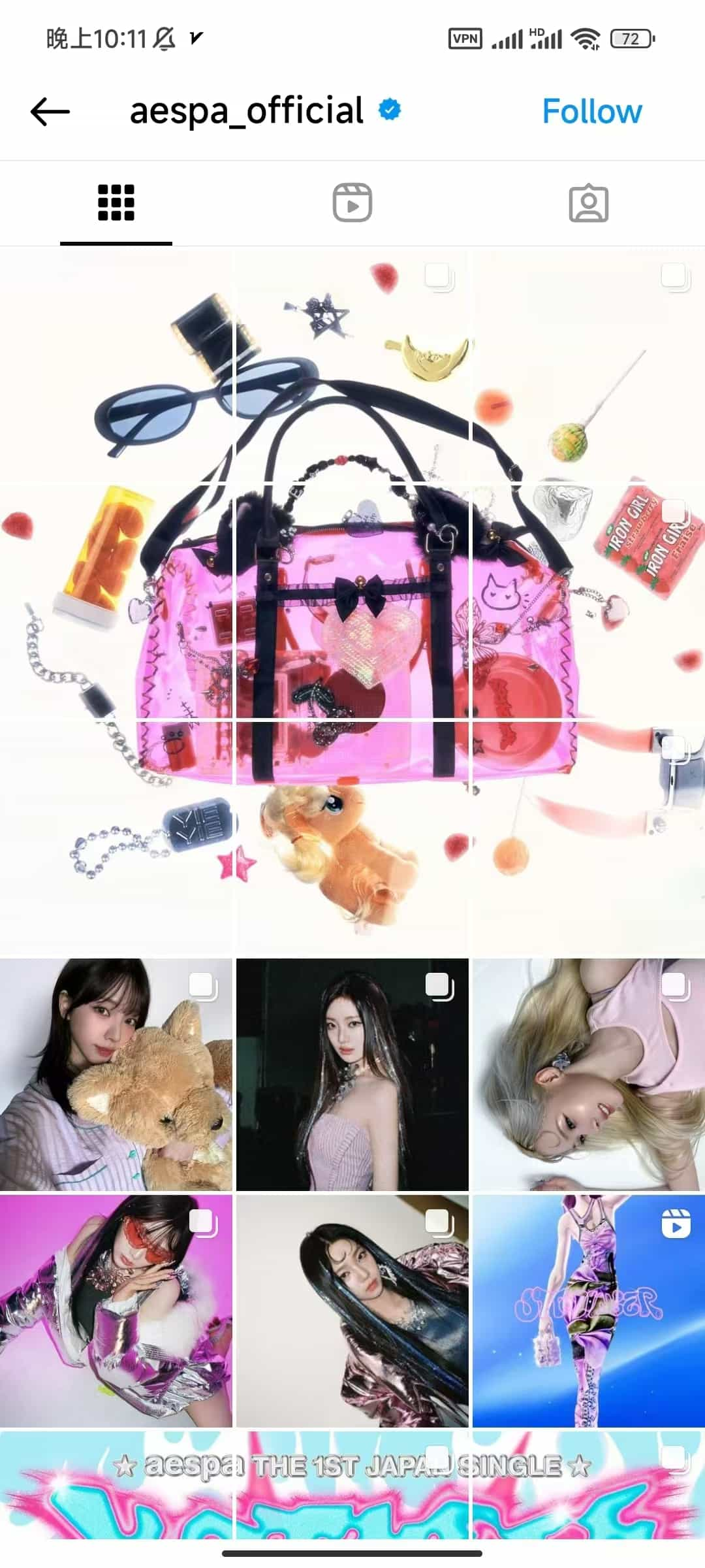
The aespa_official Instagram account demonstrates how to cleverly use grid effects to create visual impact and brand consistency:
-
Thematic coherence:
- Each set of grids revolves around a specific theme or concept, such as music video scenes, member close-ups, etc.
- The color scheme is unified, mainly using pink, purple, and blue, creating a dreamy yet modern atmosphere.
-
Diverse layouts:
- Flexibly uses 3x3, 3x1 layouts to showcase different types of content.
- Combines large images with detail close-ups, achieving both overall visual effect and highlighting individual charm.
-
Integration of brand elements:
- Cleverly incorporates promotional elements such as albums and tours, like the tour poster in the last row.
- Maintains a consistent visual style, reinforcing brand recognition.
-
Interactive design:
- Some images feature video icons, encouraging fans to click and watch, increasing interactivity.
- By splitting character images, it creates an effect that attracts users to browse the entire page.
The aespa_official case demonstrates how through carefully designed grid layouts, they can showcase the group's overall image, highlight each member's personality, and effectively conduct brand marketing.
Conclusion
Summarizing the Advantages of Instagram Cover Grid Effects
The Instagram cover grid effect provides users with a unique visual presentation method, with main advantages including:
- Strong visual impact, attracting user attention
- Providing larger creative space to showcase brand stories or product lines
- Enhancing brand recognition and professional image
- Encouraging user interaction and increasing engagement
- Flexibility to adapt to different marketing strategies and content themes
Encouraging Readers to Try Grid Generators
Creating impressive Instagram grid effects is now easier than ever. We encourage you to try Instagram grid generator tools like ImageSplitter.vip and start your creative journey. Whether you're an individual creator or a brand manager, grid effects can help you stand out in the competitive social media environment. Start experimenting now and bring a fresh visual experience to your Instagram profile!
Additional Resources
Recommended Instagram Grid Generator Tools
- Postcron Image Splitter - User-friendly, supports various splitting modes
- PineTools Split Image - Free tool, supports multiple output formats
- ImageOnline Split Image - Simple and intuitive interface
- My Social Boutique Instagram Grid Maker - Designed specifically for Instagram, provides creative templates
- ImagesTool Split Images - Offers various splitting options
- ImageSplitter.vip Instagram Splitter - Optimized specifically for Instagram, provides real-time preview
Related Tutorials and Article Links
- Complete Guide to Instagram Marketing - Hootsuite Blog
- How to Create Eye-Catching Instagram Layouts - Later Blog
- Instagram Algorithm 2023: How It Works and How to Use It - Influencer Marketing Hub
- 15 Creative Instagram Post Ideas - Sprout Social
- Instagram Best Practices: 2023 Guide - Buffer
- How to Use Instagram Reels to Promote Your Business - Social Media Examiner
These resources will help you gain a deeper understanding of Instagram marketing strategies and provide inspiration and tips for your grid creations. By combining these tools and knowledge, you'll be able to create impressive Instagram profiles.